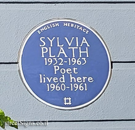
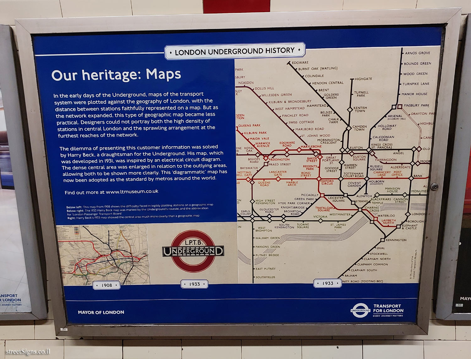
LONDON UNDERGROUND HISTORY
Our heritage: Maps In the early days of the Underground, maps of the transport system were plotted against the geography of London, with the distance between stations faithfully represented on a map. But as the network expanded, this type of geographic map became less practical. Designers could not portray both the high density of stations in central London and the sprawling arrangement at the furthest reaches of the network.
The dilemma of presenting this customer information was solved by Harry Beck, a draughtsman for the Underground. His map, which was developed in 1931, was inspired by an electrical circuit diagram. The dense central area was enlarged in relation to the outlying areas allowing both to be shown more clearly. This ’diagrammatic’ map has now been adopted as the standard by metros around the world.
Find out more at
www.ltmuseum.co.uk [Images]:
Below left: This map from 1908 shows the difficulty faced in legibly plotting stations on a geographic map
Below right: The 1933 Harry Beck map was marked by the Underground’s roundel and the abbreviation for ’London Passenger Transport Board’
Right: Harry Beck’s 1933 map showed the central area much more clearly than a geographic map
MAYOR OF LONDON
Logo of the Underground
TRANSPORT FOR LONDON - EVERY JOURNEY MATTERS
© TFL courtesy of the London Transport Museum
30


 Click for a larger image
  Click for sign's details
  Click for all signs belonging to London Underground History
 1.46 Km |
  1.47 Km |
  1.8 Km |
  2.26 Km |
 ") 2.26 Km
2.26 Km


 Click for the map of all signs belonging to London Underground History
  Click for the route that starts with this sign and goes through the signs belonging to London Underground History
 The closest sign from this series (904 Meter): London - London Underground History - Camden Town Station
 Click for all signs belonging to Interior of subway and railway stations
 Click for more details on Interior of subway and railway stations
 1.03 Km
 1.47 Km